library(ggplot2)Import
Data
data <- data.frame(
  Visit = c("Visit 2", "Visit 3"),
  MeanChange = c(-5.2, -7.8),
  SD = c(1.1, 1.5)
)
Figure
data$ymin <- data$MeanChange - data$SD
data$ymax <- data$MeanChange
p <- ggplot(data, aes(x = Visit, y = MeanChange)) +
geom_bar(stat = "identity", fill = "grey60", width = 0.6, color = "black") +
geom_errorbar(aes(ymin = ymin, ymax = ymax), width = 0.2, color = "grey30") +
labs(title = "Mean Decrease with SD (Lower Bound)",
y = "Mean Decrease", x = "") +
theme_minimal(base_family = "sans") +
theme(
panel.background = element_rect(fill = "transparent", color = NA),
plot.background = element_rect(fill = "transparent", color = NA),
panel.grid.major = element_line(color = "grey80"),
panel.grid.minor = element_blank(),
axis.text = element_text(color = "grey30"),
axis.title = element_text(color = "grey30"),
plot.title = element_text(color = "grey30", face = "bold", hjust = 0.5)
)Graph
p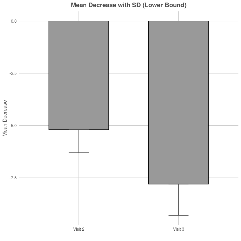
Save
# ggsave("plot.png", p, bg = "transparent", width = 6, height = 4, dpi = 300)Reference
[1] : Fixed Bsseline, Displayed Change.
[2] : Mean values were plotted over time with error bars representing standard deviation to illustrate variability across groups.