import pandas as pd
import matplotlib.pyplot as plt

import plotly.express as pxReference
Import
Data
df = pd.read_csv('../../../delete/Perfumes_dataset.csv').query("target_audience!='Target Audience'")- category가
Fruity Sweet Gourmand이고 target_audience가 unisex임
df.at[203, "category"] = "Fruity Sweet Gourmand"
df.at[203, "target_audience"] = "Unisex"- 성별 통일
mapping = {
    "Female": "Female",
    "Women": "Female",
    "Male": "Male",
    "Men": "Male",
    "Unisex": "Unisex"
}

df["target_audience"] = df["target_audience"].map(mapping)- category 단어 구별
split_cols = df["category"].str.split(" ", expand=True)
df["cat1"] = split_cols[0]
df["cat2"] = split_cols[1]
df["cat3"] = split_cols[2]- longevity 통일
mapping = {
    "Strong": "Strong",
    "Medium": "Medium",
    "Medium–Strong ": "Medium–Strong",
    "Medium ": "Medium",
    "Strong ": "Strong",
    "Very Strong": "Very Strong",
    "Light": "Light",
    "Light–Medium ": "Light–Medium",
    "Light–Medium": "Light–Medium",
    "6–8 hours": "Light–Medium"
}

df['longevity_level'] = df["longevity"].str.split(":", expand=True)[0]

df["longevity_level"] = df["longevity_level"].map(mapping)
df.head()| brand | perfume | type | category | target_audience | longevity | cat1 | cat2 | cat3 | longevity_level | |
|---|---|---|---|---|---|---|---|---|---|---|
| 0 | dumont | nitro red | edp | Fresh Scent | Male | Strong | Fresh | Scent | None | Strong |
| 1 | dumont | nitro pour homme | edp | Fresh Scent | Male | Strong | Fresh | Scent | None | Strong |
| 2 | dumont | nitro white | edp | Fresh Scent | Unisex | Strong | Fresh | Scent | None | Strong |
| 3 | dumont | nitro blue | edp | Fresh Scent | Unisex | Strong | Fresh | Scent | None | Strong |
| 4 | dumont | nitro green | edp | Fresh Scent | Unisex | Strong | Fresh | Scent | None | Strong |
- type 통일
df.type.unique()array(['edp', 'edt', 'parfum', 'EDP', 'Extrait de Parfum', 'Parfum',
'EDT', 'Extrait', 'Cologne', 'Alcohol-free', 'Attar',
'Concentrate', 'Oil'], dtype=object)| Raw 값 예시 | 표준화 값 | 설명 |
|---|---|---|
edp, EDP |
EDP (Eau de Parfum) | 가장 흔한 형태 (15–20%, 5–8시간 지속) |
edt, EDT |
EDT (Eau de Toilette) | 가볍고 산뜻 (5–15%, 3–5시간) |
parfum, Parfum |
Parfum | 진하고 오래감 (20–30%, 8–12시간) |
Extrait de Parfum, Extrait |
Extrait | 최고 농도 (30% 이상, 12시간+) |
Cologne |
EDC (Eau de Cologne) | 가볍고 빠르게 사라짐 (2–5%, 1–3시간) |
Alcohol-free, Oil, Attar, Concentrate |
Oil/Attar | 알코올 없는 오일 기반 향수, 지속력 강하지만 확산력은 약할 수 있음 |
mapping = {
    "edp": "EDP",
    "EDP": "EDP",
    "edt": "EDT",
    "EDT": "EDT",
    "parfum": "Parfum",
    "Parfum": "Parfum",
    "Extrait de Parfum": "Extrait",
    "Extrait": "Extrait",
    "Cologne": "EDC",
    "Alcohol-free": "Oil/Attar",
    "Attar": "Oil/Attar",
    "Concentrate": "Oil/Attar",
    "Oil": "Oil/Attar"
}

df["type_standardized"] = df["type"].map(mapping)
df.head()| brand | perfume | type | category | target_audience | longevity | cat1 | cat2 | cat3 | longevity_level | type_standardized | |
|---|---|---|---|---|---|---|---|---|---|---|---|
| 0 | dumont | nitro red | edp | Fresh Scent | Male | Strong | Fresh | Scent | None | Strong | EDP |
| 1 | dumont | nitro pour homme | edp | Fresh Scent | Male | Strong | Fresh | Scent | None | Strong | EDP |
| 2 | dumont | nitro white | edp | Fresh Scent | Unisex | Strong | Fresh | Scent | None | Strong | EDP |
| 3 | dumont | nitro blue | edp | Fresh Scent | Unisex | Strong | Fresh | Scent | None | Strong | EDP |
| 4 | dumont | nitro green | edp | Fresh Scent | Unisex | Strong | Fresh | Scent | None | Strong | EDP |
- brand pie chart를 plotly로 만들자
- target_audience pie chart를 plotly로 만들자
- category별 target 구분
- type별 longevity구분
Brand 상위 20 Ratio
- 개수 카운트
brand_counts = df["brand"].value_counts()
brand_counts.head()
Jean Paul Gaultier 94
paris corner 77
armaf 70
Al Haramain 43
fragrance world 42
Name: brand, dtype: int64- 상위 20개
top20_brands = brand_counts.nlargest(20).index
top20_brands
Index(['Jean Paul Gaultier', 'paris corner', 'armaf', 'Al Haramain',
'fragrance world', 'Lattafa', 'Azzaro', 'Hugo Boss', 'Giorgio Armani',
'Afnan', 'Dior', 'Ajmal', 'Hermès', 'Prada', 'Maison Alhambra',
'Louis Vuitton', 'Creed', 'Victoria's Secret', 'Carolina Herrera',
'Dolce & Gabbana'],
dtype='object')- 재그룹화된 열 합치기
df["brand_grouped"] = df["brand"].where(df["brand"].isin(top20_brands), "Others")
df.head()| brand | perfume | type | category | target_audience | longevity | cat1 | cat2 | cat3 | longevity_level | type_standardized | brand_grouped | |
|---|---|---|---|---|---|---|---|---|---|---|---|---|
| 0 | dumont | nitro red | edp | Fresh Scent | Male | Strong | Fresh | Scent | None | Strong | EDP | Others |
| 1 | dumont | nitro pour homme | edp | Fresh Scent | Male | Strong | Fresh | Scent | None | Strong | EDP | Others |
| 2 | dumont | nitro white | edp | Fresh Scent | Unisex | Strong | Fresh | Scent | None | Strong | EDP | Others |
| 3 | dumont | nitro blue | edp | Fresh Scent | Unisex | Strong | Fresh | Scent | None | Strong | EDP | Others |
| 4 | dumont | nitro green | edp | Fresh Scent | Unisex | Strong | Fresh | Scent | None | Strong | EDP | Others |
- pie chart 만들기 위한 데이터셋
brand_grouped_counts = df["brand_grouped"].value_counts().reset_index()
brand_grouped_counts.columns = ["brand", "count"]
plotly
fig = px.pie(
    brand_grouped_counts,
    names="brand",
    values="count",
    title="Top 20 Brands (Others grouped)",
    width=600, height=600,
    template='seaborn'
)
fig.show()
matplotly
labels = brand_grouped_counts["brand"]
sizes = brand_grouped_counts["count"]

# 파이차트 그리기
fig, ax = plt.subplots(figsize=(8,8))
wedges, texts, autotexts = ax.pie(
    sizes,
    labels=labels,
    autopct="%1.1f%%",   # 비율 표시
    startangle=90,       # 시작 각도
    textprops={"color": "black"}
)

ax.set_title("Top 20 Brands (Others grouped)", fontsize=14)
plt.tight_layout()
plt.show()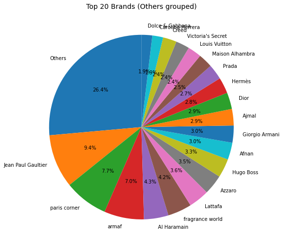
- 브랜드는 고르게 분포
성별 비율
target_audience_counts = df["target_audience"].value_counts().reset_index()
target_audience_counts.columns = ["target_audience", "count"]
# target_audience_counts = target_audience_counts.query('count!=1')
plotly
fig = px.pie(
    target_audience_counts,
    names="target_audience",
    values="count",
    title="target_audience",
    width=600, height=600,
    template='seaborn'
)
fig.show()
matplotly
labels = target_audience_counts["target_audience"]
sizes = target_audience_counts["count"]

# 파이차트
fig, ax = plt.subplots(figsize=(6, 6))
wedges, texts, autotexts = ax.pie(
    sizes,
    labels=labels,
    autopct="%1.1f%%",   # 비율 표시
    startangle=90,       # 시작 각도
    textprops={"color": "black"}
)

ax.set_title("Target Audience", fontsize=14)
plt.tight_layout()
plt.show()
- 비율 동일
category 별 타겟 구분
1st
df["cat1"].value_counts().nlargest(10)Woody 260
Floriental 136
Oriental 114
Amber 96
Floral 77
Fresh 61
Aromatic 38
Unknown 38
Citrus 33
Fruity 33
Name: cat1, dtype: int64- 상위 5개
top5_cat1 = df["cat1"].value_counts().nlargest(5).index
top5_cat1
Index(['Woody', 'Floriental', 'Oriental', 'Amber', 'Floral'], dtype='object')- 데이터셋에서 그 5개에 해당하는 것만 가져오기
df_top5 = df[df["cat1"].isin(top5_cat1)]- 집계
counts = df_top5.groupby(["target_audience", "cat1"]).size().reset_index(name="count")bar chart
plotly
fig = px.bar(
    counts,
    x="target_audience",
    y="count",
    color="cat1",
    barmode="group",
    title="Top 5 category(1st) by Target Audience",
    width=1000, height=600,
    template='seaborn'
)
fig.show()
matplotly
pivot_df = counts.pivot(index="target_audience", columns="cat1", values="count").fillna(0)

# grouped bar chart
ax = pivot_df.plot(
    kind="bar",
    figsize=(10, 6),
    width=0.8
)

plt.title("Top 5 category(1st) by Target Audience", fontsize=14)
plt.xlabel("Target Audience")
plt.ylabel("Count")
plt.legend(title="cat1")
plt.xticks(rotation=0)  # x축 라벨 세로로 안 돌리게
plt.tight_layout()
plt.show()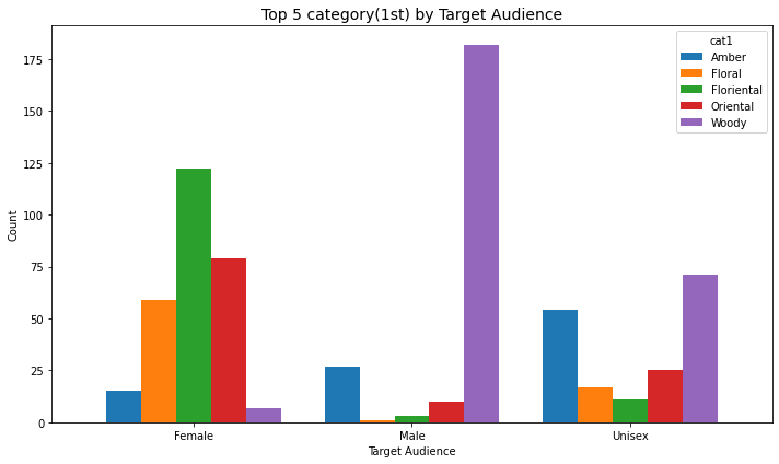
- 남성은 woody향을 내세우고
- 여성은 floriental 향을 내세우는군
- 두 개는 성별로 약간 극단적
2nd
df["cat2"].value_counts().nlargest(10)Spicy 200
Floral 174
Aromatic 94
Fruity 78
Woody 44
Fougere 34
Scent 25
Oriental 25
Aquatic 20
Gourmand 16
Name: cat2, dtype: int64- 상위 5개
top5_cat2 = df["cat2"].value_counts().nlargest(5).index
top5_cat2
Index(['Spicy', 'Floral', 'Aromatic', 'Fruity', 'Woody'], dtype='object')- 데이터셋에서 그 5개에 해당하는 것만 가져오기
df_top5 = df[df["cat2"].isin(top5_cat2)]- 집계
counts = df_top5.groupby(["target_audience", "cat2"]).size().reset_index(name="count")bar chart
plotly
fig = px.bar(
    counts,
    x="target_audience",
    y="count",
    color="cat2",
    barmode="group",
    title="Top 5 category(2nd) by Target Audience",
    width=1000, height=600,
    template='seaborn'
)
fig.show()
matplotly
pivot_df = counts.pivot(index="target_audience", columns="cat2", values="count").fillna(0)

# grouped bar chart
ax = pivot_df.plot(
    kind="bar",
    figsize=(10, 6),
    width=0.8
)

plt.title("Top 5 category(2nd) by Target Audience", fontsize=14)
plt.xlabel("Target Audience")
plt.ylabel("Count")
plt.legend(title="cat2")
plt.xticks(rotation=0)
plt.tight_layout()
plt.show()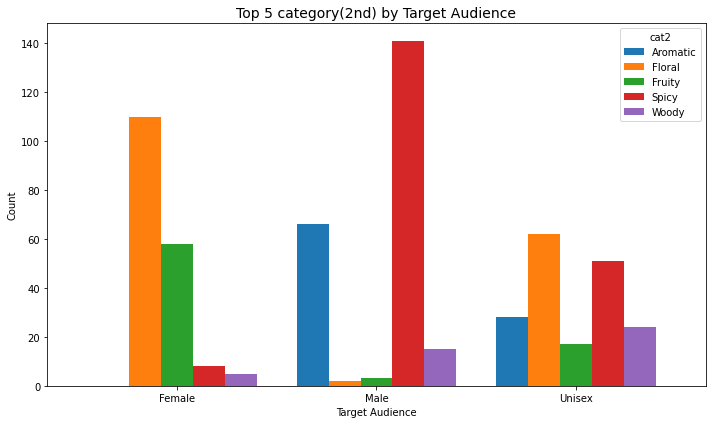
- 남성은 spicy향 아주 내세우고
- 여성은 floral향
- 이것도 성별로 극단적
type 별 구분
df.type_standardized.value_counts()EDP 764
EDT 161
Parfum 39
Extrait 21
EDC 11
Oil/Attar 7
Name: type_standardized, dtype: int64order = ["Light","Light–Medium","Medium","Medium–Strong","Strong","Very Strong"]
by_type = df.groupby(["type_standardized","longevity_level"]).size().reset_index(name="count")
type_order = by_type.groupby("type_standardized")["count"].sum().sort_values(ascending=False).indexplotly
custom_colors = {
    "Light": "#a6cee3",
    "Light–Medium": "#1f78b4",
    "Medium": "#33a02c",
    "Medium–Strong": "#fb9a99",
    "Strong": "#e31a1c",
    "Very Strong": "#6a3d9a"
}

fig = px.bar(
    by_type,
    x="type_standardized",
    y="count",
    color="longevity_level",
    barmode="stack",
    category_orders={"type_standardized": list(type_order), "longevity_level": order},
    title="Longevity Levels by Type (counts)",
    width=1000, height=800,
    template='seaborn',
    color_discrete_map=custom_colors  # 직접 매핑
)

fig.show()
matplotly
custom_colors = {
    "Light": "#a6cee3",
    "Light–Medium": "#1f78b4",
    "Medium": "#33a02c",
    "Medium–Strong": "#fb9a99",
    "Strong": "#e31a1c",
    "Very Strong": "#6a3d9a"
}

fig = px.bar(
    by_type,
    x="type_standardized",
    y="count",
    color="longevity_level",
    barmode="stack",
    category_orders={
        "type_standardized": list(type_order),
        "longevity_level": list(custom_colors.keys())  # 순서 고정
    },
    title="Longevity Levels by Type (counts)",
    width=1000, height=800,
    template='seaborn',
    color_discrete_map=custom_colors
)

fig.show()| Raw 값 예시 | 표준화 값 | 설명 |
|---|---|---|
edp, EDP |
EDP (Eau de Parfum) | 가장 흔한 형태 (15–20%, 5–8시간 지속) |
edt, EDT |
EDT (Eau de Toilette) | 가볍고 산뜻 (5–15%, 3–5시간) |
parfum, Parfum |
Parfum | 진하고 오래감 (20–30%, 8–12시간) |
Extrait de Parfum, Extrait |
Extrait | 최고 농도 (30% 이상, 12시간+) |
Cologne |
EDC (Eau de Cologne) | 가볍고 빠르게 사라짐 (2–5%, 1–3시간) |
Alcohol-free, Oil, Attar, Concentrate |
Oil/Attar | 알코올 없는 오일 기반 향수, 지속력 강하지만 확산력은 약할 수 있음 |
EDP만
plotly
fig = px.pie(
    by_type.query("type_standardized == 'EDP'"),
    names="longevity_level",
    values="count",
    title="EDP",
    width=600, height=600,
    template='seaborn',
    color="longevity_level",                # 색 기준 열 지정
    color_discrete_map=custom_colors        # 색 매핑
)
fig.show()
matplotly
fig = px.pie(
    by_type.query("type_standardized == 'EDP'"),
    names="longevity_level",
    values="count",
    title="EDP",
    width=600, height=600,
    template='seaborn',
    color="longevity_level",
    color_discrete_map=custom_colors,
    category_orders={"longevity_level": list(custom_colors.keys())}  # 순서 고정
)
fig.show()- edp는 medium이 많고 그다음 strong
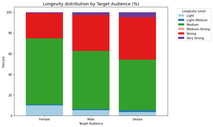
성별 longevity level
df.target_audience.value_counts()Unisex 376
Female 331
Male 296
Name: target_audience, dtype: int64plotly
# 집계
by_aud = df.groupby(["target_audience","longevity_level"]).size().reset_index(name="count")

# 각 target_audience별 총합
by_aud["percent"] = by_aud.groupby("target_audience")["count"].transform(lambda x: x / x.sum() * 100)

# bar chart (percent 사용)
fig = px.bar(
    by_aud,
    x="target_audience",
    y="percent",
    color="longevity_level",
    barmode="stack",
    category_orders={"longevity_level": ["Light","Light–Medium","Medium","Medium–Strong","Strong","Very Strong"]},
    title="Longevity distribution by Target Audience (%)",
    width=800, height=600,
    template='seaborn',
    color_discrete_map=custom_colors
)
fig.show()
matplotly
pivot_df = by_aud.pivot(index="target_audience", columns="longevity_level", values="percent").fillna(0)

# 색상 매핑
custom_colors = {
    "Light": "#a6cee3",
    "Light–Medium": "#1f78b4",
    "Medium": "#33a02c",
    "Medium–Strong": "#fb9a99",
    "Strong": "#e31a1c",
    "Very Strong": "#6a3d9a"
}
colors = [custom_colors[col] for col in pivot_df.columns]

# stacked bar chart
ax = pivot_df.plot(
    kind="bar",
    stacked=True,
    color=colors,
    figsize=(10, 6),
    width=0.8
)

plt.title("Longevity distribution by Target Audience (%)", fontsize=14)
plt.xlabel("Target Audience")
plt.ylabel("Percent")
plt.legend(title="Longevity Level", bbox_to_anchor=(1.05, 1), loc="upper left")
plt.xticks(rotation=0)
plt.tight_layout()
plt.show()